


Meteorology 101: Understanding Indexes
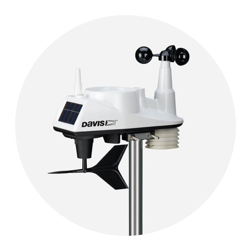
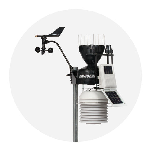
Your Vantage Pro2™ or Vantage Vue gives you more than just raw weather data. While raw data is very useful, our systems offer several indexes that can increase your understanding of what that data means if you happen to be, you know, a human being. They can tell you what you want to know in terms of your comfort in the current conditions.

Different kinds of temperature indexes
Indexes (or indices) represent apparent temperatures, which means their goal is to communicate how people actually experience current conditions. It can be easy to think of apparent temperatures as what it "feels like."
We need apparent temperatures because, 98°F/37°C is a completely different experience in dry California compared to humid Florida, and 60°F/16°C can feel much different in the Windy City of Chicago than it might in relatively still Los Angeles.
Here are a few of the most common apparent temperature indexes with real-world examples of when they're most useful:
WIND CHILL: On a cold day, humans create a thin layer of warm air close to the skin. A brisk wind can whisk away this layer, leaving us feeling colder. Wind chill tells you just how much colder.
We’ve all experienced wind chill. Imagine hitting the ski slopes on a brisk morning with the temperature around 18°F/-8°C and the wind calm. Lovely! But about 2 in the afternoon, the wind picks up to a brisk 20 mph/9 mps. Even with the afternoon air temperature warmer at 20°F/-6°C, it now feels like 4°F/-16°C.
As wind increases, so do the dangers associated with cold. Should that wind rise to say, 30 mph and air temp drops to 5°F/-15°C, the wind chill will be -19°F/-28°C, making frostbite likely in 30 minutes or less.
HEAT INDEX: We’ve all heard, “It’s not the heat, it’s the humidity!” A person sitting in the shade on a 100°F/38°C day in Phoenix might be quite comfortable, while a person sitting in the shade on a 100°F/38°C degree day in New Orleans is facing imminent heat stroke, cool drink or not.
What could have made the difference? If the humidity in New Orleans is 60% (that’s below the 72.5% year-round average in New Orleans), the heat index will be 129°F/54°C. Her counterpart in Phoenix in the humidity of, let’s say, 30% is going to feel like it’s just 102°F/39°C (a perfectly balmy day in Phoenix). The person in Phoenix will perspire and the perspiration will evaporate, making her feel much cooler. But for the folks on that hot day in New Orleans, perspiration will not evaporate quickly into the already sodden air.
The body can be overwhelmed in its struggle to stay cool and heat stroke, a dangerous condition that requires emergency treatment, is a real threat.
 THW INDEX: This index adds a little more information to the heat index by adding wind. (The heat index assumes winds are calm.) While we usually think of wind as cooling, if it is hot enough (over 93°F/34°C), wind will make you feel even hotter.
THSW INDEX: This is the granddaddy of all the indexes! If you know the THSW, you know how it will feel to a person out there in the current conditions. It stands for Temperature Humidity Sun Wind: all the players! Like the heat index, it uses temperature and humidity. Like the wind chill and THW indexes, it also includes the effect of wind. And then it adds further clarity by including the heating effects of solar radiation.
WBGT INDEX: Wet-bulb globe temperature (WBGT) is a measure of heat stress that's frequently used in worker and athlete safety contexts to determine whether or not activity is advisable. It's based on measurements gathered by a variety of precision instruments: wet bulb temperature (expressing how well sweat will help people cool), black globe temperature (which expresses how solar radiation will impact your clothed body), and dry-bulb air temperature (the standard thermometer temperature).
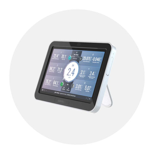
How to view temperature indexes on your WeatherLink Console
If you've got a Davis weather station and WeatherLink Console, you can configure the device to display a variety of apparent temperatures, including heat index, wind chill, THW, and THSW (with an additional solar radiation sensor added).
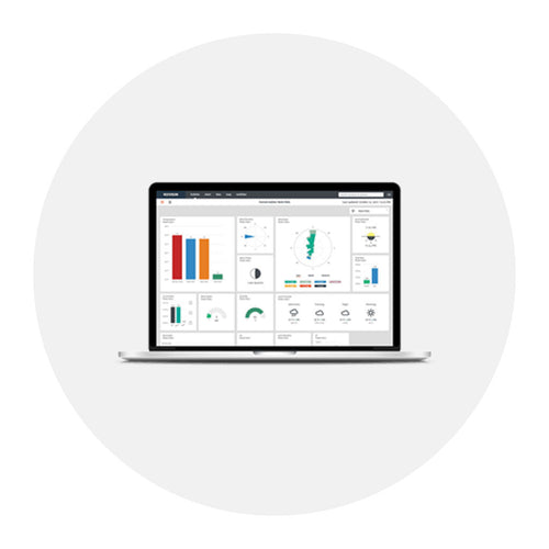
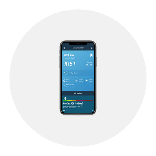
If you'd like to view an index on your console dashboard, you can customize a main display tile or choose one of the four "Weather Bubbles" to visualize the data. In the WeatherLink app, scroll down to the "Feels Like" section. On WeatherLink.com, you'll see them on your bulletin dashboard as their own tile, if you have them selected from the parameters list.
![]()
In the face of escalating environmental risks, AEM is the essential source for insights on weather, climate, lightning, floods, wildfires, water management, and more.
Learn more about AEM and all of our solutions here.